Food Ordering app
Role
Visual Designer
UI/UX
Front End Developer
Official Site
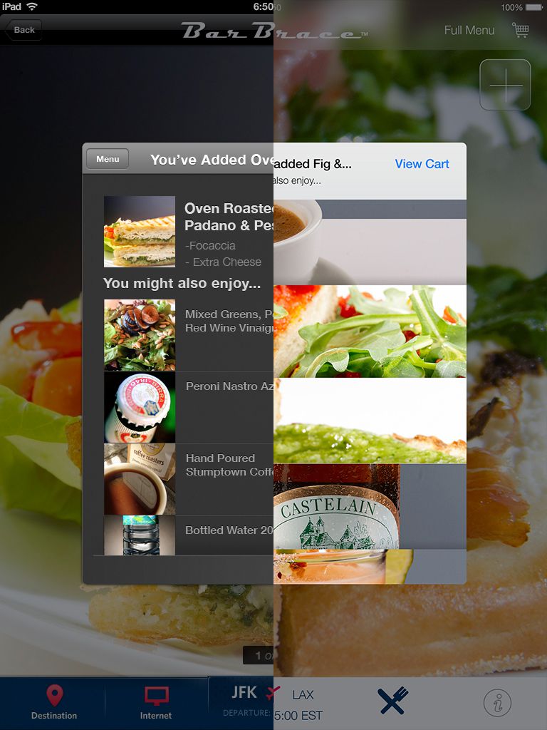
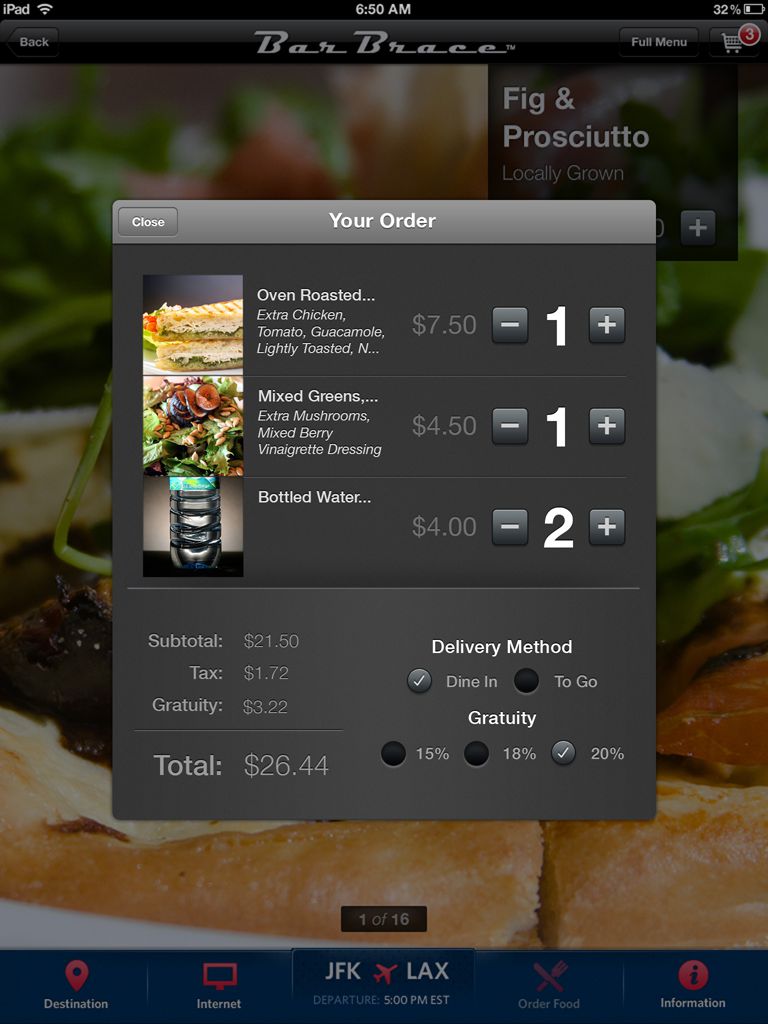
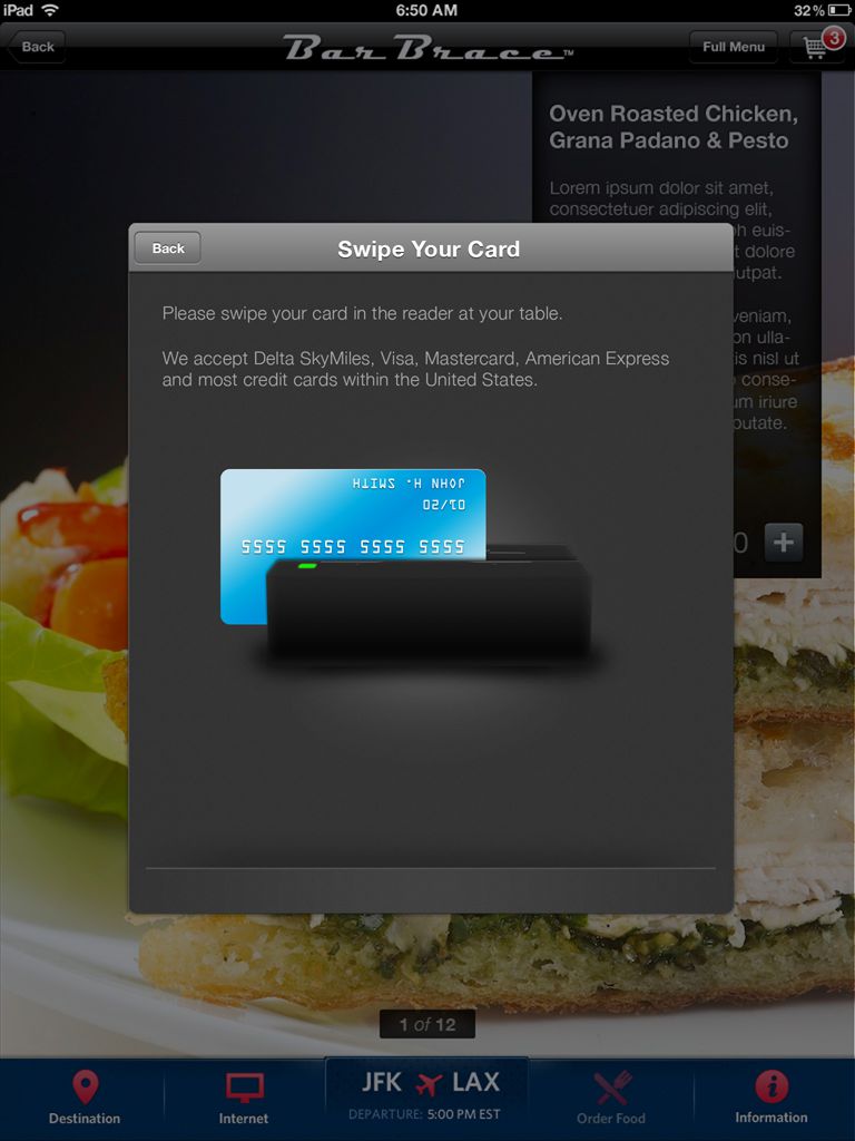
Control GroupOne of my first big projects as a Design Technologist at CG was for a company to offer iPad menus in internation airports. My job was to to design and develop the front end of food ordering experience. Within the restaurants and at every table in the terminal was an iPad to browse around the web, check arrival times and, more importantly, order food.
The restaurant menu design would accommodate multiple restaurants, while still retaining a refined, classy look.
The design process had already been iterated by two previous designers, who were no longer at the company, so it left me with the fortunate position of taking the best parts of their work and going from there.
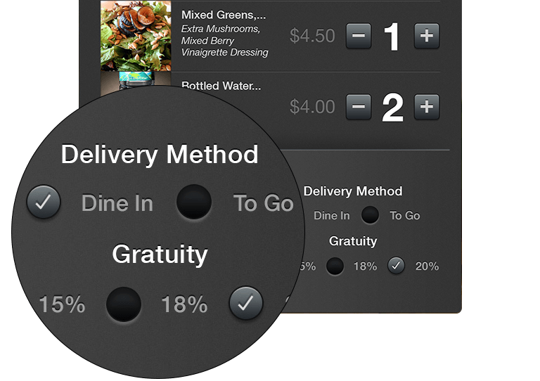
My first focus was an updated design language for the menu app that could be both classy and yet broad enough for multiple restaurants. We held weekly design meetings with the development team to ensure feasibility. After getting design approval from the client, I went about developing the front end. We were using and ERB templating language and CSS, though I snuck in LESS preprocessing to help speed up my workflow.
The Sudden Switch to Retina
During our development process, word began swirling that the upcoming iPads would be in high resolution, also known as a Retina screen view. Rather than recreate all the icons twice, we made sure all our Photoshop icons were made in vector, so we would be relatively save from the change.
iOS7 Refresh
Here is an unused design for the conversion to the flatter design style that was introduced in iOS 7. The cleaner style afforded more opportunities to provide the user with richer content and a chance to show off the great food photography aka 'food porn'.